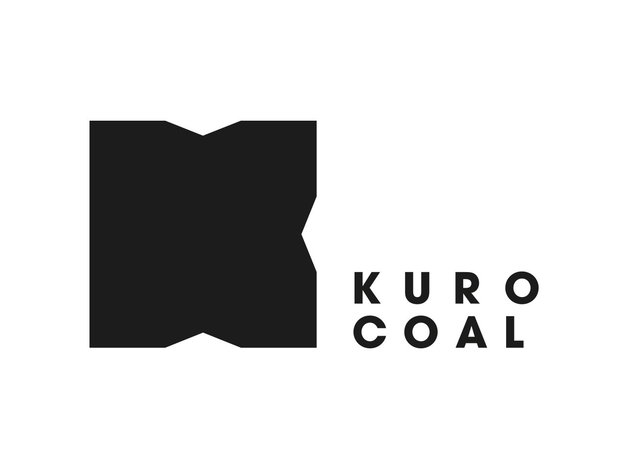
Kuro Coal
Kuro Coal is a mining exploration company with projects in Canada.
The name Kuro is Japanese for black which is reflective of the highest grade of dark coking coal. We wanted to adapt this meaning to the brand and give it a corporate look balanced with the organic nature of coal. The K symbol is represents an open map, which is a subtle nod to geological exploration.
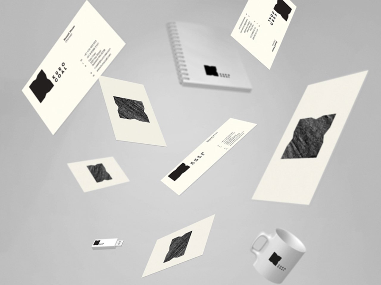
– Branding
– Logo Design
– Art Direction
– Web Design